Monday 24 February 2014

Edmundo Sanz Gadea


Edmundo Sanz Gadea is a Spanish artist based in Madrid. He bag working in advertising in 1988 as an illustrator and art director before developing his career design agencies, Direct Marketing and Advertising as a creative art director. This involved creating and developing direct marketing campaigns, brochures and graphic designs. Currently, he only uses the method of painting in his work.
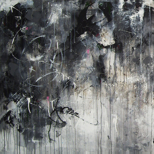
http://d3oeu2l8qd7s1b.cloudfront.net/414389-10786185-7.jpg

NY Skyline Attack Before (created April 19th 2012)    Mediums: Oil on board      Size: 31.5 x 48 x 1.6 in

This piece is described as being ‘Abstract expressionism artwork representing the skyline of the city before the brutal attack of 11S 2009’. (http://www.saatchiart.com/art/Painting-NY-SKYLINE-ATTACK-BEFORE/414389/1556904/view)

This piece is an expressive piece that looks quite archaic because the colours used are quite dark and brown-toned. The silhouette of New York is situated slightly to the right of the piece and has been painted in shades of black, blue and grey which looks quite abrupt against the soft looking background. There is a lack of bold lines; however, the black around the buildings makes them look more prominent. Below this is a subtle reflection of what can be seen above which gives the look of the city floating on water. The sombre colour scheme may be to represent the artists feeling toward the event, which would obviously be very negative because it was so traumatic. It appears that the background colours have been applied to the board using a sponge as they look very soft and faded.


http://d3oeu2l8qd7s1b.cloudfront.net/414389-10786035-7.jpg


Metropolis Building (Madrid)        Medium: Oil on canvas         Size: 59.1 X 39.4 X 1.6 in

This is a city view of the Metropolis building in Madrid which is described as being one of the most significant and photographed buildings in the capital city. It has been painted in an array of shades of white, blue, grey and black, with the lettering being painted in a vibrant yellow colour. The background looks like a series of subtle squares have been painted so as to represent the buildings surrounding the Metropolis. The tone on the building has been picked out with a light blue and a pale grey which clearly looks more subtle than black and white. In the bottom left corner, it looks as though black paint has been splattered using a paintbrush in order to replicate a bush nearby.

This artist’s work is very different to my first artist as he is more expressive and pays less attention to absolute detail.  He also uses paint, rather than a pen or pencil, however, he sticks with the theme of building and architecture. The second piece fits perfectly with my theme as the building has lettering on it.

Sunday 23 February 2014

Photographs (Continued)

Some photographs I have taken over the holidays of things that relate to my theme.


Friday 14 February 2014

Observational Drawings

Below are some observational drawings I have done of some objects that relate to my theme of 'Buildings with Lettering'. Some of the objects have textures similar to buildings, whereas others are of lettering that I have tried to replicate.


Artist Research - August Endell


August Endell

I found this artist/architect in a book about architecture in the library at college.


Photograph of the Buntes Theatre, Berlin.


August Endell was an architect born in Berlin, Germany in 1871. He was a self-taught architect. He is known for being one of the founders of the Jugenstil movement, which is the expressive movement in Art Nouveau. He is famous for many of his designs, including the Atelier Elvira Photographic studio in Munich, the Buntes Theatre in Berlin (1901) and Hackesche Höfe. In the book that I found, I came across his design for the Buntes Theatre. The theatre has now been destroyed, however, Endell designed the decorative elements of the buildings and used a diverse colour palette, which links to the name of the building, as 'Bunte' means coloured.

Artist Research - Banksy


Bansky is a very famous graffiti street-artist based in Bristol, England. His birth name or date of birth is not known to the public. His work combines dark humour with politics and graffiti created using a very unique stencilling technique and his work is features on walls, bridges and streets all over the world. He started off as a butcher, however became interested in graffiti during the ‘great Bristol aerosol boom’ in the 80’s. He was inspired by an artist called 3D who later went on to be a founding member of Massive Attack, a music group. Banksy is well known for disagreeing with the idea from the government that graffiti art is vandalism and tends to display his work on extremely public surfaces.

http://www.ufunk.net/wp-content/uploads/2010/08/banksy-lies-politics-550x675.jpg

This piece by Banksy was painted using spray paint and stencil onto a public wall. At the top, bold black lettering spells out the phrase ‘If you repeat a lie often enough, it becomes the truth’. Below this is a picture of a young girl in black and white who has crossed out the word ‘truth’ and has written ‘politics’ underneath in red. Bansky has obviously made this piece as controversial and as provocative as possible. Underneath the text and image of the young girl, white graffiti can be seen which gives the piece more depth and texture.


https://blogger.googleusercontent.com/img/b/R29vZ2xl/AVvXsEjs12wI8zF6G4PP9uLzReyi95fijBSrFmrT2Cpwy5LpdU_OiN8A9o2STf8MHegjYSvbHnDEXmFiOBX3MbWKsCd433gYfHd3y9EHQjeMVLtYD81pDEOguOx9SvD0nnocAgpEs7wGvo9ka30/s1600/BanksyNoFuture.jpg

This piece shows another young girl, this time sat at the bottom of the wall. She is holding a balloon which is actually the O in the text on the image which says ‘No Future’. Again, this piece is controversial and provocative as the text is quite negative and pessimistic and people tend to want to look on the brighter side of life. Underneath the main image and lettering, chipped paint and older graffiti can be seen which gives it more depth and makes it look more old. The picture of the girl is quite obviously stencilled on and the lines are quite bold and uniform, not like it was a spontaneous painting.

 
 have chosen to look at Banksy because he paints on buildings, which links to my theme of ‘buildings with lettering’ in a more out-of-the-box way. I also like how the colours used on most of his pieces are very limited; he usually sticks to black, white and red. This could be to reflect the seriousness behind the messages in the individual pieces.

Tuesday 11 February 2014

Artist Research - Stephen Wiltshire


Stephen Wiltshire is a British artist born in London on 24th April 1974. At the age of three, he was diagnosed with a form of autism. As a child, he was a mute and found it very difficult to relate to other people. When he turned five years old, he was sent to Queensmill School in London where it became obvious that he had a flair for drawing. He studied fine art at City and Guilds Art College.

Wiltshire specialises in landscape drawings, particularly cityscapes. He is well-known for being able to draw extremely detailed landscape from memory, sometimes after only seeing the landscape once for a brief time. In 2006, he was awarded an MBE for his services to art and since has opened up his own gallery.

Manhattan skyline from the Intercontinental Hotel - drawings and paintings by Stephen Wiltshire MBE

Manhattan Skyline from The Intercontinental Hotel   Medium: Pen and ink   Size: 420 X  297mm (A3)

This piece is a very detailed landscape of Manhattan, drawn in black pen and ink. The drawing features buildings of different sizes, shapes and architectural styles (some modern, some a lot older). Wiltshire has used a variety of lines in different sizes and pressures in order to replicate the view from his hotel room and add tone to the sketch, making it look less flat. As some of the lines used are quite angular, the piece looks very 3D and realistic. The contrast between the lightest colours and the darkest colours are quite abrupt, particularly around the edges of the buildings which makes the silhouettes of each building look more prominent against the sky.


Street scene of 34th street New York - drawings and paintings by Stephen Wiltshire MBE

Street Scene of 34th Street New York      Mediums: Pen and Ink       Size: 210 X 297 MM (A4)

This piece is a very detailed sketch of a street in New York. In the picture you can see various skyscraper style buildings and an array of vehicles. It was drawn from eye level and the buildings are drawn at an angle, giving the piece depth. Again, pen and ink has been used to give tone and to recreate each tiny detail perfectly. Wiltshire has used thin marks to create the illusion of movement with the cars and to show tone.

Both of these pieces relate to my exam work as they are architectural sketches and therefore, focus around buildings (my theme being buildings with lettering). On the second image in particular, some lettering is visible.

Thursday 6 February 2014

Buildings with Lettering (Photographs)

A series of photographs taken in preperation for my AS exam. I have chosen 'Buildings with Lettering' as my starting point.


Dagmar Hrickova - 'Childhood Memories'

image 


Dagmar Hrickova was born in the Czech Republic and is now based in the outskirts of New York. She completed her American Arts Certificate at UCLA. She takes her inspiration from the ever-changing world around her and often finds herself studying the people around her.
This piece of work entitled ‘Childhood Memories’ by Dagmar Hrickova was created in an oil paint/ acrylic medium. The use of colour is interesting as Hrickova has used the colour magenta, which cannot be made using a mixture of primary colours. This gives the painting a more surreal and unrealistic look about it. It appears that the paint has been applied using a sponge, giving it a cloudy look which could represent that the memories that are being conveyed being quite faded and clouded over. The colours are quite dark which suggests that Hrickova is showing unpleasant memories or memories that she isn’t very fond of.

Hannah Kaspar - 'Memory is a Ghost Part III'

image 


Hannah Kaspar is an American artist based in Brooklyn, NY. She was born in Ossining, NY in 1981 and recieved a BFA in painting from Tyler School of Art in 2003 and also from Glasgow School of Art, four years later.
Created in the mediums of oil, acrylic, canvas collage on woodboard and housepaint, this piece of work by Kaspar focuses on memories that fade away. Her work also focuses a great deal on architecture and imagined interiors.
The first layer of the image appears to have been a painting of a room, possibly a room that she remembers from her past or that she has imagined. The colours she used are quite muted, which suggests that she has not seen or invisaged for quite some time and is finding it difficult to remember it vividly. The next layers is black acrylic, covering parts of the first image in a swirly pattern. This represents the memories that Kaspar is trying to convey fading slowly or clouding over and becoming less obvious. Over the top of this layer, in slightly more solid and bright colours and at the middle-bottom,  is some small house-hold objects (a chair, a record player, curtains). The fact that the colours are different suggests that these are the items that she remembers most vividly.
Kaspar describes her work as ‘historical fiction, a fantastical way of exploring her personal history’.

Cy Twombly - Apollo and The Artist

image 


Edwin Parker ‘Cy’ Twombly Jr was an American artist born April 25th 1928 in the state of Virginia, USA. He is well-known for creating simple, calligraphic styled graffiti paintings in shades of grey, blue, off-white and tan colours. His works blur the lines between drawings, writing and painting, and he is often influenced by classical myths and poetry.
This piece is called ‘Apollo and the Artist’ (1975). It was created using mixed media, and incorporates a limited colour scheme of off-white, blue and black. The background of the picture is white in colour, and two rectangular shaped pieces of paper seem to have been stuck on it: one above the other (the top being the largest). Several off-white brush strokes can be seen over the top of this white page and a light blue-white colour has been painted over these pieces of paper. At the top, the word/name ‘Apollo’ has been written in a bold, blue ink. Below this is some drawings of leaves, lines and musical notes in black ink. Across the very top of the picture is a long black arrow, pointing right, which is broken up by more unclear drawings of what appear to be musical notes or leaves.
The fact that the word/name ‘Apollo’ is written at the top of the picture suggests to me that the meaning behind the piece is related to the God that shares the name Apollo. This idea is echoed by the leaves (Apollo was often depicted wearing a wreath of laurel leaves upon his head) and the musical notes, as he was known as the god of music.
This piece links with my project because it is very much centred around the past, which is what I plan on focusing my work on (memories). Also, the use of tonal colours and the colour blue (which is a primary colour) is something I intend to use in my own work, as I feel that too much colour makes an image look unrealistic and distracting

Holly Thoburn

image 


Holly Thoburn is an urban impressionist and was born and raised in and around London. Her influences come from her travels to places such as India, Berlin and Australia and the street art that she sees there. Her work incorporates a mix of graffiti, colour, street art, textures and it mainly focuses on the decay of urban landscapes and spaces. To create her pieces, she takes photographs of places with features that she finds interesting and recreates them on a canvas.
 I cannot find the name of this piece by Thoburn, however I find it particularly interesting.  It is mixed media on canvas.
The main colours/tones used in the image are black, white and grey, however, a small amount of pink can be seen. At the top and on the left hand side of the picture, it appears that different shades of black and grey have been dappled onto the canvas, showing very little of the white canvas below. It looks as though the grey paint has run down the page at different lengths, eventually disappearing off the edge of the canvas. A small amount of pink paint can be seen beneath the different layers of tonal paint and ink and it looks as though Thoburn has scraped some of the paint away, revealing a crisp white colour below. In the top left corner of the picture, a sad face appears to have been painted over the layered paint. Toward the bottom of the picture is a black graffiti tag, which is covered slightly by a layer of grey paint.
I think that this piece reflects Thoburn’s concept of decaying urban spaces very well, as the black, grey and white give the picture a very harsh and urban feel. The tag-line towards the bottom of the picture echoes the urban feel, as graffiti is very common in cities and other urban area today.  It is obvious from this picture that she wanted to reflect how urban places change and fade over time. The lack of colour could also suggest that she finds cities today very lifeless, bleak and uninteresting places.
The piece links to my project because Holly Thoburn took photographs of different places in the cities she visited when she was travelling and then re-created them onto a canvas, and my project focuses on the theme of ‘memories’ which can be captured by photography and then recreated. It also links to my project because the work looks quite faded and uses tones, rather than a lot of colour, which is what I intend to do.

Pledge - Robert Rauschenberg

image 

         Rauschenberg created this piece in 1968 in the medium of lithograph on paper.
 
Robert Rauschenberg was an American artist whose work is known to have greatly influenced the 1950s Pop Art movement. He was born in Port Arthur, Texas on 22nd of October 1925 and died at the age of 82 in Florida on 12th of May 2008. He was both a painter and a sculptor, but also worked with photography, papermaking, printmaking and performance. He has received various different awards for his work, including the National Medal of Arts and the Leondardo Da Vinci World Award of Arts. His influences included people like Jasper Johns, John Cage and Marcel Duchamp.
I find it very interesting how, on this piece, he used greyscale photographs (which he seems to use very often in his work) from newspapers or magazines to make a simple yet effective collage. Some of the photographs used appear to have a blue tint which gives looks quite like biro ink. The pictures used look quite faded and aged. The collage incorporates pictures of a woman, a car, some baseball players, a farmer holding some plants and a skyscraper, all of which seem quite disconnected and unrelated, so the fact that the collage is only in black and white means that it doesn’t look too busy and overdone. The pictures are pasted in a quite disorganised manner on the plain white page and do not appear to follow a pattern, making it seem chaotic, in a way, yet still quite simple. They aren’t placed too close to each other which again, echoes the fact that the collage in simple and not too overdone.
The collage may be useful when I’m doing my work as the photographs appear to be memories that Rauschenberg may have had. The unorganised and seemingly unrelated pictures could represent that his memories are quite scattered or difficult to remember and the dark colours could represent his feelings at the time (them possibly being fairly negative). The piece also links to the work I have been doing in class recently, as lithography is a way of printing making that I could use in addition to the methods I have already tried.

Photographs (Memories, traces, faded)

A series of photographs I have taken for my AS Fine Art project, relating to the words 'memories, traces and faded'.